Brand Strategy & Logo Design for Kice Store
![]()
Client: Kice Store
Project: Logo & Brand Identity
Project Goal: To create a friendly, “cute,” and trustworthy brand identity to stand out in the competitive game top-up market.
- Strategy: I chose to target a more casual, style-conscious gamer audience. Instead of a techy or aggressive logo, this friendly design lowers the barrier to entry and makes the purchasing process feel safer and more welcoming.
- Design:
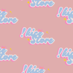
- Typography: I created a custom, bubbly, and slightly retro logotype that feels playful and unique.
- Color: The soft pastel blue and vibrant bubblegum pink create a fun, eye-catching, and friendly palette.
- Iconography: To add a mascot element, a small, cute pink cat peeks over the letters, making the brand instantly memorable. The yellow sparkles are a direct, playful nod to the “diamonds” and “treasure” the store provides.